

This post contains affiliate links. If you click through and make a purchase, we may earn a commission at no extra cost to you. We only recommend services we believe are genuinely useful.
Shopify store design mistakes are usually the real reason a store gets traffic but no orders, and most owners never find out because nobody tells them what to look for.
You can have great products and decent ads and still lose customers in the first five seconds, simply because of how the store looks and feels the moment someone lands on it.
The good news is that every mistake on this list is fixable, some in an afternoon, some worth handing to a professional. Here are the seven shopify design tips that make the biggest difference, and exactly what to do about each mistake.
Why Store Design Directly Controls Your Conversion Rate
Shoppers decide whether to trust a store within seconds of the page loading, long before they’ve read a single product description.
That snap judgment is built entirely from visual signals: how clean the layout feels, whether the photos look real, whether the site seems put together by someone who cares. A weak Shopify conversion rate almost never comes down to bad products.
It comes down to a store that quietly tells visitors “this might not be legitimate” before they’ve even scrolled.
If you’ve ever wondered why customers leave an online store without buying anything, this is usually where it starts, not with the product, but with what happens in the first few seconds on the page.
If you’re already getting clicks from ads or Pinterest and still not seeing sales, design is one of the first places to look, right alongside what’s covered in our full guide on why stores get traffic but no sales.
Mistake #1: Cluttered Homepage (And the Fix)
A homepage trying to say everything at once ends up saying nothing. Banner sliders, five competing promotions, a dozen navigation links, and product grids stacked on top of each other all fighting for attention in the first three seconds someone’s on your site.
Visitors don’t know where to look, so a lot of them just leave.
The fix is subtraction, not addition. Pick one clear message for your homepage: what you sell, why it’s different, and one obvious next step. Cut the slider down to a single strong image.
Group products into two or three clear sections instead of ten. Whitespace isn’t wasted space, it’s what makes the important things visible.
Mistake #2: No Trust Signals Above the Fold
New visitors are silently asking “is this a real business?” before they ask anything about your products. If the top of your homepage has zero reviews, no security badges, no real contact information, and nothing that looks like an established brand, a lot of cautious shoppers bounce right there.
Add visible trust signals early: a star rating or review count, a secure checkout badge, a real return policy mentioned in plain sight, or a short line about who you are and where you ship from.
These are small additions that directly address the hesitation stopping people from buying, which is exactly why ecommerce trust signals show up in almost every conversion audit.
Mistake #3: Weak or Missing Product Photography
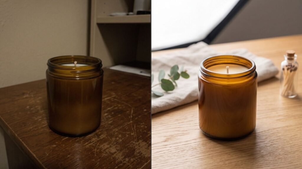
This is the mistake that costs the most sales and gets fixed the least. Blurry photos, inconsistent lighting, stock images that don’t match what actually ships, or only one angle per product.
Shoppers can’t touch or try your product, so the photos are doing all the convincing, and weak ones read as a warning sign rather than a small inconvenience.
At minimum, every product needs multiple angles, a lifestyle or in-use shot, and consistent lighting and background across your whole catalog.
Consistency matters almost as much as quality, because a catalog where every third product looks like it came from a different store erodes trust just as fast as bad photos do.
Mistake #4: Confusing Navigation
If a visitor can’t find what they came for within a couple of clicks, they assume you don’t have it, even when you do. Overloaded mega menus, unclear category names, or a search bar that returns nothing useful all quietly push people toward the back button.
Keep your main navigation to a handful of clear categories a first-time visitor would actually recognize. Test your own search bar with a few real product names and typos. If your catalog is small, consider skipping a complex menu altogether and just showing everything on one clean shop page.
Mistake #5: Mobile Layout Problems
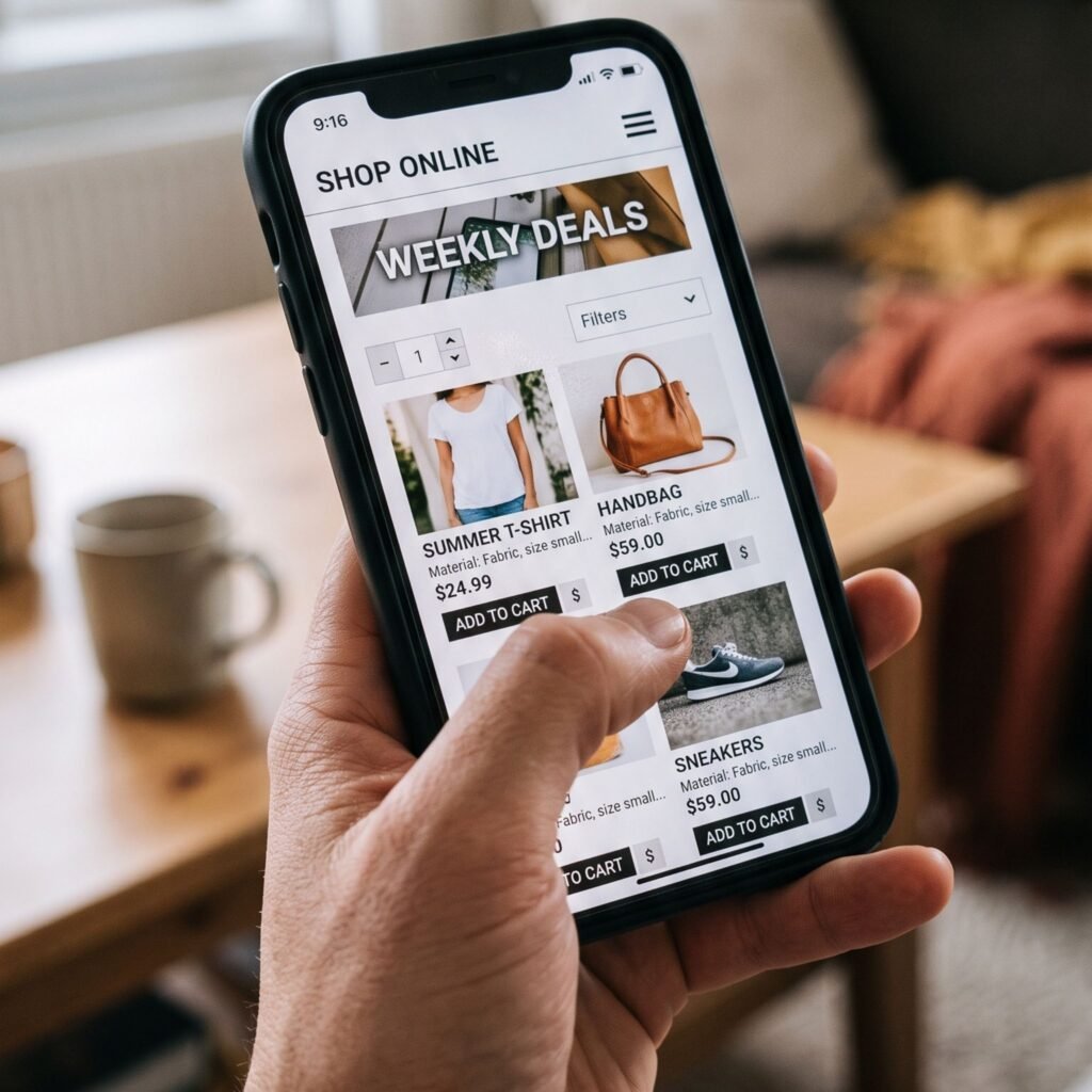
Most Shopify traffic comes from phones, and most owners still design and check their store almost exclusively on a desktop screen.
Buttons that are too small to tap, images that get cropped wrong, text that runs off the edge, checkout fields that are painful to fill in with a thumb. Every one of these is a silent conversion killer on the device most of your visitors are actually using.
Open your own store on your phone right now and try to buy something from start to finish. Every point of friction you hit is a point where a real customer just gave up.
Mistake #6: No Clear Shipping/Return Info
Hidden or missing shipping costs and return policies are one of the most common reasons carts get abandoned at the very last step. If a shopper has to hunt for this information or discovers a surprise fee at checkout, you lose the sale you’d already nearly closed.
State shipping timelines and costs clearly, ideally before checkout, not buried in a footer link nobody clicks. Make your return policy easy to find and easy to understand in one short paragraph. Certainty is what closes the sale here, not necessarily free shipping.
Mistake #7: Generic Branding That Looks Like Everyone Else
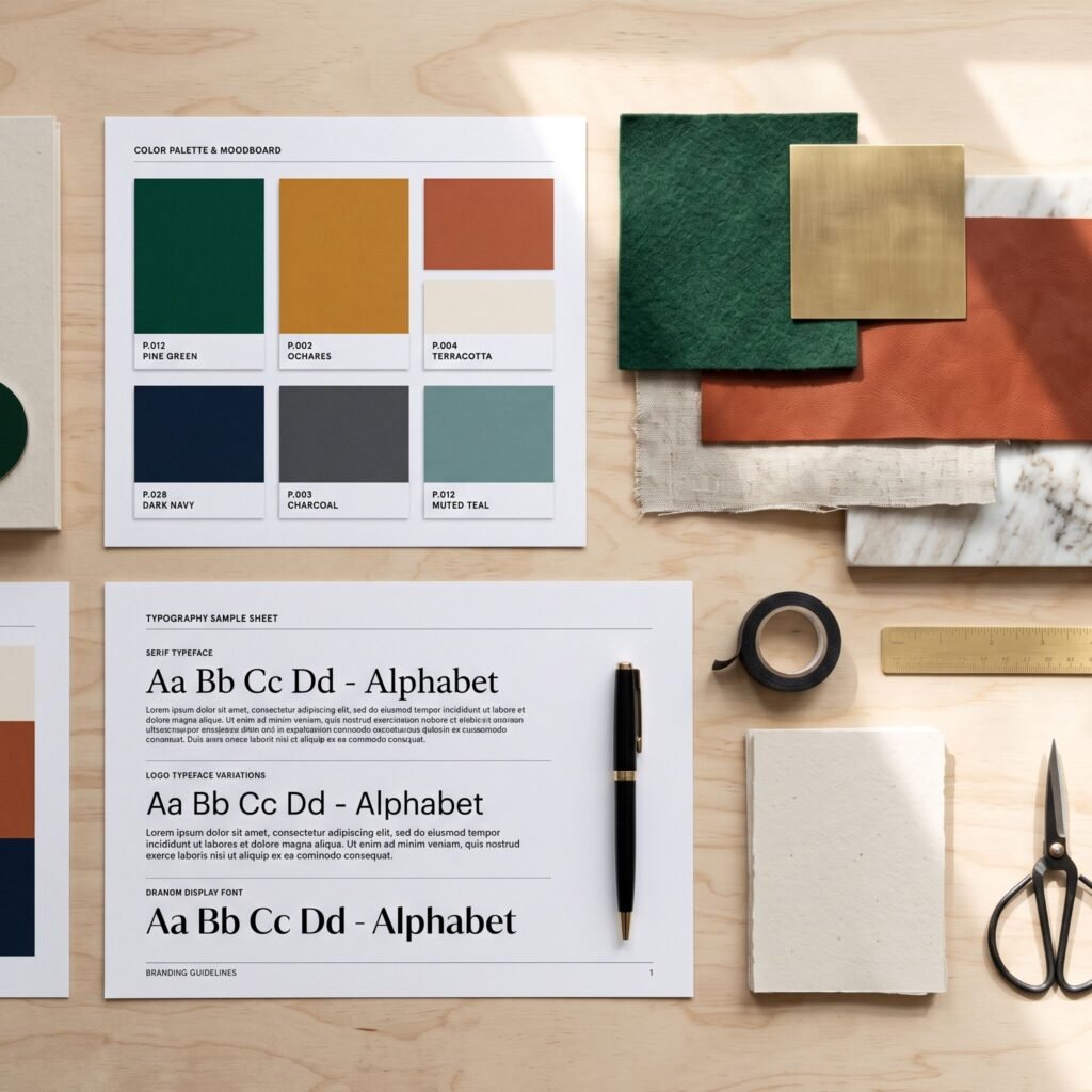
Same free theme, same stock fonts, same layout as ten thousand other Shopify stores. Nothing about it says who you are or why anyone should remember you over the next store in their search results.
Generic branding doesn’t just look uninspired, it actively makes a store harder to trust, because it reads as low effort.
Distinct typography, a real color palette instead of default theme colors, and photography that matches a consistent style are what separate a store that feels like a brand from one that feels like a template.
If you want to see exactly which small tweaks create that shift, our guide on making a Shopify store look premium breaks down the eight changes that matter most.
If three or more of these sound familiar, a redesign pays for itself fast, usually within the first few extra sales it recovers. See redesign prices here.
Which Fixes Are DIY, and Which Need a Designer?
Some of these are genuinely a weekend project. Fixing your shipping and return page copy, tightening your navigation menu, cutting homepage clutter, these just take time and a willingness to be ruthless about what stays. Anyone comfortable in the Shopify editor can knock these out without help.
Others are harder to fix well without design experience, and this is usually where a proper Shopify store redesign earns its cost rather than the DIY route saving you money.
Product photography that actually looks consistent and professional, a mobile layout that feels intentional rather than patched together, and branding that looks custom rather than templated all benefit from someone who does this for a living and has already solved these exact problems on other stores.
Trying to DIY a full visual overhaul often means spending more hours than the redesign would have cost in the first place.
What a Professional Shopify Redesign Costs on Fiverr
Redesign pricing on Fiverr generally breaks into three ranges depending on scope. Quick, targeted fixes, things like cleaning up a homepage or fixing mobile responsiveness on a few key pages, typically run from $50 to $90.
A fuller redesign covering your homepage, product pages, and overall branding usually lands between $90 and $200.
A complete premium rebrand, including custom sections, a refined visual identity, and conversion-focused layout work throughout the store, runs from $200 up to around $340 with top-rated specialists.
Given that a single lost sale from a bad first impression can easily exceed these numbers, most owners find the redesign pays for itself well before the first month is over.
FAQ
How much is a Shopify redesign?
A targeted redesign fixing specific issues typically costs $50 to $90. A full store redesign covering homepage, product pages, and branding usually runs $90 to $200, with premium, fully custom work going up to around $340.
How do I know if my store design is the problem?
If you’re getting consistent traffic but a low conversion rate, if visitors add to cart but don’t check out, or if you personally hesitate while looking at your own store on a phone, design is very likely part of the problem, not just your products or pricing.
Can a redesign really increase sales?
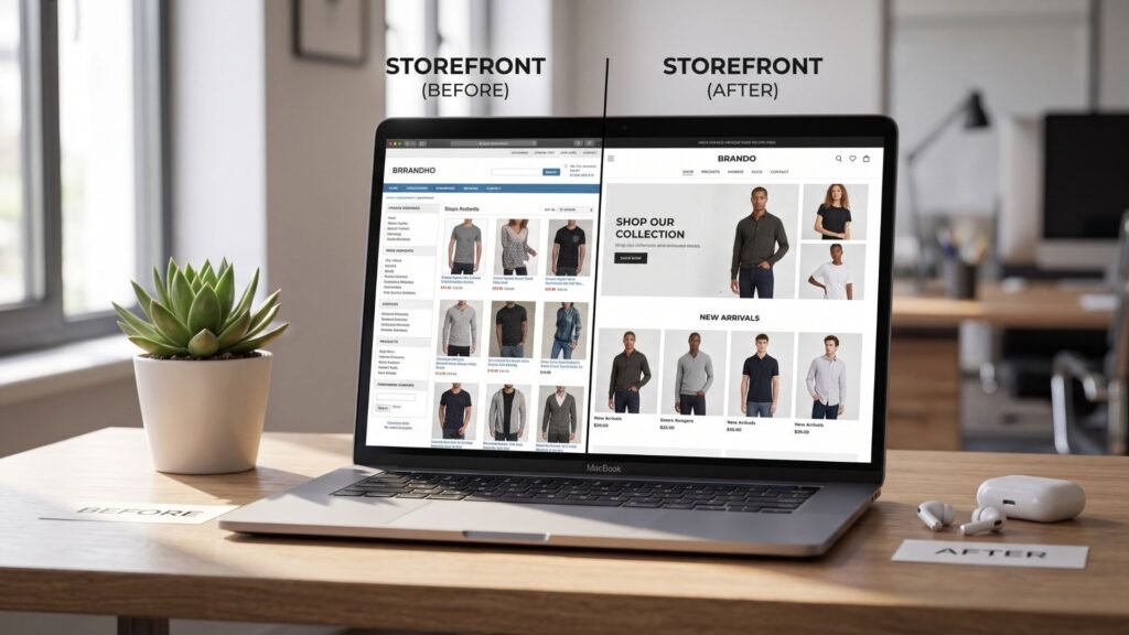
Yes. Since design controls first impressions and trust, fixing even three or four of the mistakes above commonly improves conversion rate measurably, often enough to cover the cost of the redesign within the first few weeks.
Ready to fix what’s actually costing you sales? Compare Shopify redesign experts on Fiverr and see real portfolios, pricing, and reviews before you decide who to hire.
1 thought on “7 Shopify Store Design Mistakes That Are Killing Your Sales”